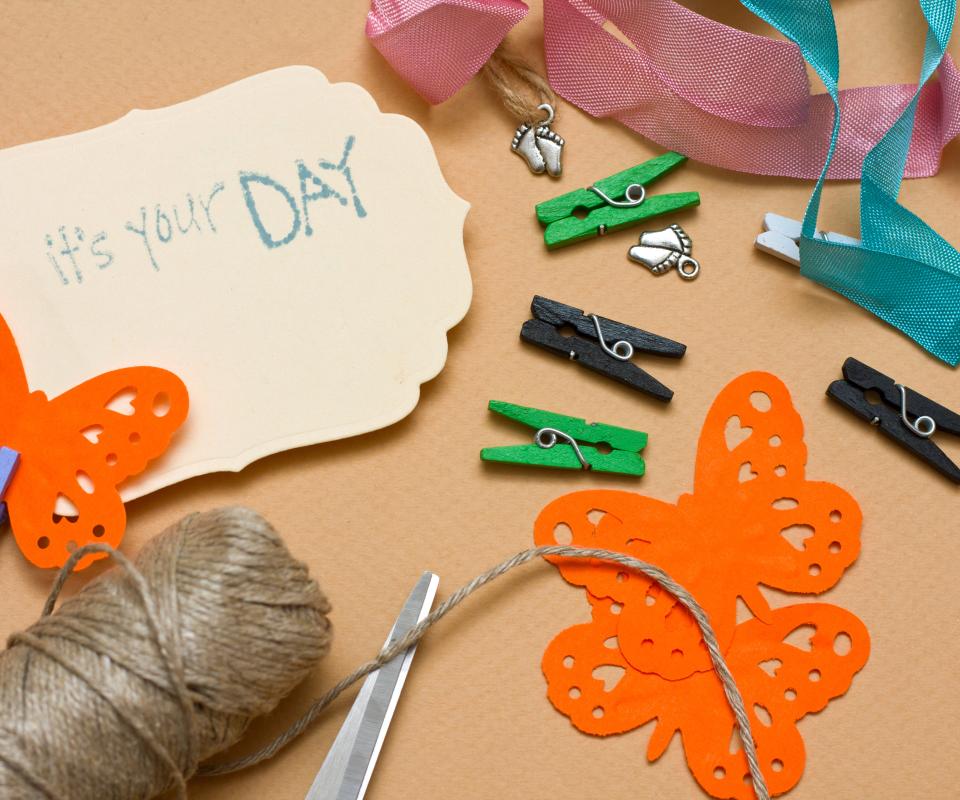
Best Colors for Background in Scrapbook

To choose the best scrapbooking backgrounds for a scrapbook page, the designer must take into account the theme of the page, the color scheme she wants to use, and the different pictures that will go onto the page once it's finished. Often the photographs will determine what colors the designer should use and after developing a color scheme she can incorporate additional details and accents to dress up the page. When creating an entire book, she may keep a consistent theme throughout. The colors and elements can change from page to page, but she may decide that the overall style — simplistic, complex, vintage, or modern to name a few examples — will stay the same throughout the book.

The designer should start by laying out the photographs that will go on a set of scrapbook pages. She should identify common colors used in the photos and pick three or four to use in the scrapbooking backgrounds and decorations. One color should be the dominant color and used for the largest sections of the background. The next color should be the secondary color and used often but not quite as much as the dominant color. The third and even fourth colors are the accent colors and are used for small pieces like paper photo frames.

Common color schemes include black, white, and red for a modern look or off-white, light black, and pale pink for traditional wedding scrapbooking backgrounds. Black and white photos work well with these layouts because the designer does not need to match the backgrounds to colors in the photograph. For color photographs, she should use the dominant background color in the photo for the dominant background color on the scrapbook page.
For example, a picture of a child playing in a green field against a blue sky would have a lot of green in it. Using green as the background color and a light blue as a secondary color will unite the grass and sky in the picture with the scrapbook page's background. Next, the designer could look at the child's clothing and use that for an accent color. If he is wearing a red shirt, she may include a single red decoration, such as red text or a red sticker, somewhere on the page to create visual unity and interest.
Texture also plays an important role in choosing scrapbooking backgrounds. Paper ranges from thin, smooth pages to thicker pages with rough texture. Patterned textures, such as swirls, are also available. A designer should consider how formal or playful the page should feel and match the background to this theme. Thicker papers will work best for attaching 3D decorations and heavy items.
Finally, designers should keep color and theme in mind when choosing digital scrapbooking backgrounds. While digital scrapbook designers don't need to worry about weight, implied texture is still possible and can enhance the overall effect. A designer should choose the color scheme for the page in the same way she would a real scrapbook by examining colors used in the photographs and picking the three best.
Best Colors for Background in Scrapbook
Source: https://www.wise-geek.com/how-do-i-choose-the-best-scrapbooking-backgrounds.htm
0 Response to "Best Colors for Background in Scrapbook"
Post a Comment